


11 Designing Instructional Materials
Introduction
Often, our lessons will be accompanied by instructional materials such as slide decks, videos, handouts, and worksheets. Used well, these materials are integral to the session, and to be effective, they need the same careful level of planning and design as the rest of our lesson. While creating high-quality materials takes time, the good news is you do not need to be a graphic-design expert to make materials that are clear, user friendly, and accessible to all audiences. This chapter outlines strategies for creating effective instructional materials. It begins with some background on the cognitive processes that impact use and understanding of instructional materials and then outlines general best practices. The chapter concludes with design suggestions for a variety of materials. Specific attention is given to universal design principles and accessibility of all materials.
Theoretical Background and Best Practices
Instructional materials typically provide a physical and/or visual supplement to a session in the form of slides, handouts, and images. Because these materials often combine both visual and textual elements and often supplement an audio delivery such as a lecture, learners are asked to interact with both aural and visual information; therefore, some background on the cognitive processes that this experience entails can inform the design of materials. Perhaps the most important thing to consider when delivering information in multiple formats simultaneously is cognitive load, or the strain on learners as they try to hold information in memory while also trying to process new information. Cognitive load “is a theory about learning built on the premise that since the brain can only do so many things at once, we should be intentional about what we ask it to do” (Heick, 2019). Clark and Mayer (2016, p. 35) identify three issues that impact cognitive load:
- Dual Channels: Different parts of the brain are used to process visual and auditory information. When video and audio reinforce each other, as when images or text on a slide reinforce a speaker’s point, learning is enhanced. However, if video and audio are misaligned, such as when slide text is different from the audio narration, the brain has to work harder, and learning can be negatively impacted. This is not to suggest that instruction should be delivered only in one format, but that we make informed decisions about how we structure and present the information in different formats, as explained in more detail below. While the theory of dual channels is primarily applied to audiovisual materials like voice-over videos and tutorials, the concept is relevant when we are using textual and visual materials to support a live lecture or demonstration as well.
- Limited Capacity: Individuals can process a limited amount of information in each channel at one time. As such, instructors must carefully select pieces of information to include and make intentional decisions about how to present that information.
- Active Processing: Learning happens when people can identify and access the important information in a lesson, process that information, and relate it to their prior knowledge. Good design can facilitate active processing.
The brain’s limited capacity impacts its ability to engage in active processing and, hence, to learn. We can avoid cognitive overload and facilitate active processing by reducing or eliminating extraneous information from our instructional materials. Clark and Mayer (2016) provide tips for lightening the cognitive load and maximizing active processing, organized around nine major principles. These principles are geared toward multimedia learning and are discussed in more depth in Chapter 16, but several principles apply to textual materials and visual aids:
- Coherence Principle: Omit unneeded words, sounds, and graphics.
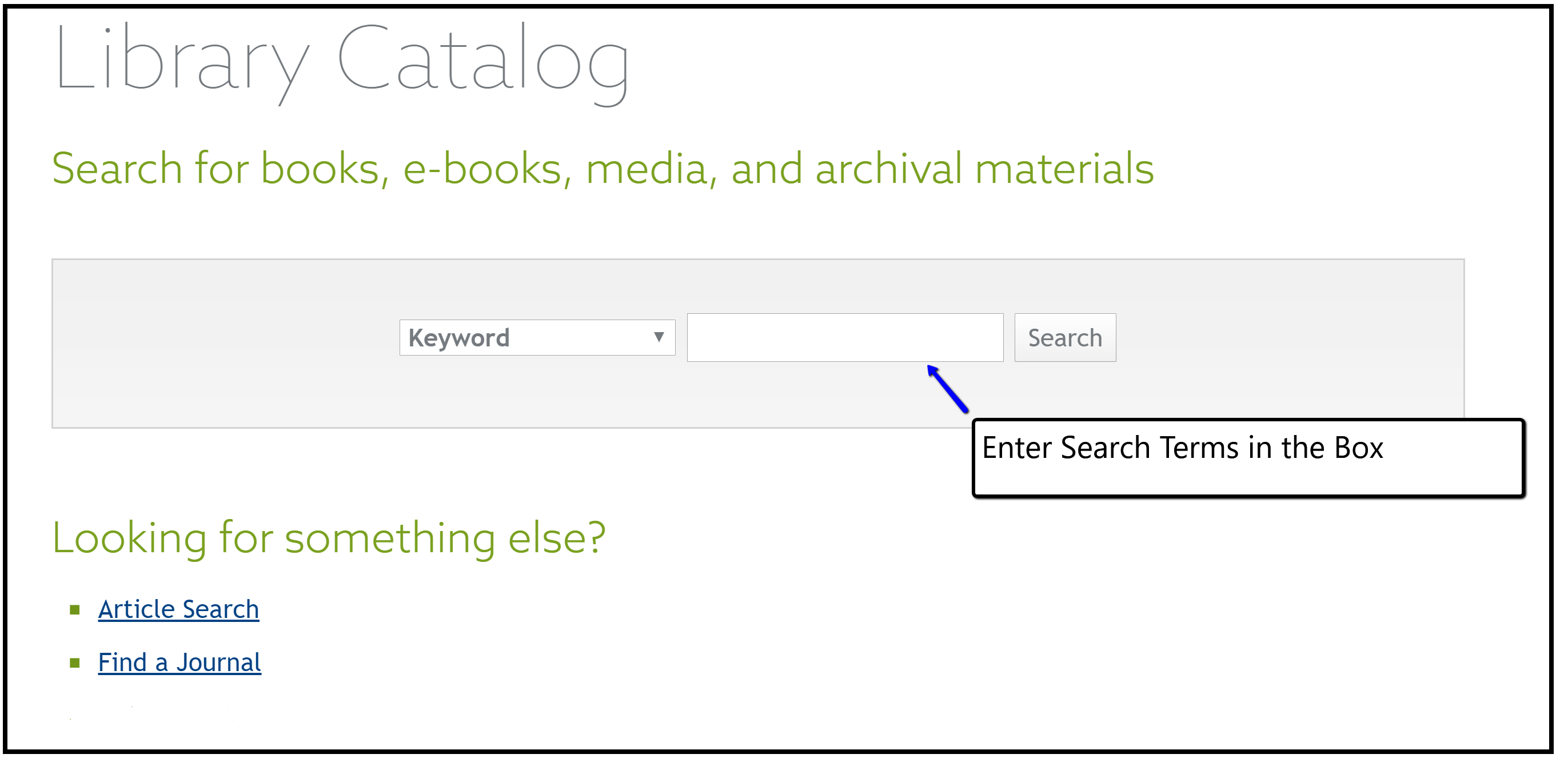
- Contiguity Principle: Place printed words next to the corresponding part of a graphic (see Figure 11.1 and Figure 11.2 for examples).
- Redundancy Principle: Do not duplicate audio and on-screen text.
These principles emphasize the importance of minimizing extraneous content and streamlining presentation, which reduce cognitive load for learners. Managing the amount and presentation of information facilitates active processing and makes content more accessible. Cognitive load theory and the accompanying design principles draw on broader cognitive science learning theories introduced in Chapter 3, and some of the ideas probably sound familiar from other discussions in this textbook.
Figure 11.1: Example of Poor Contiguity in a Graphic
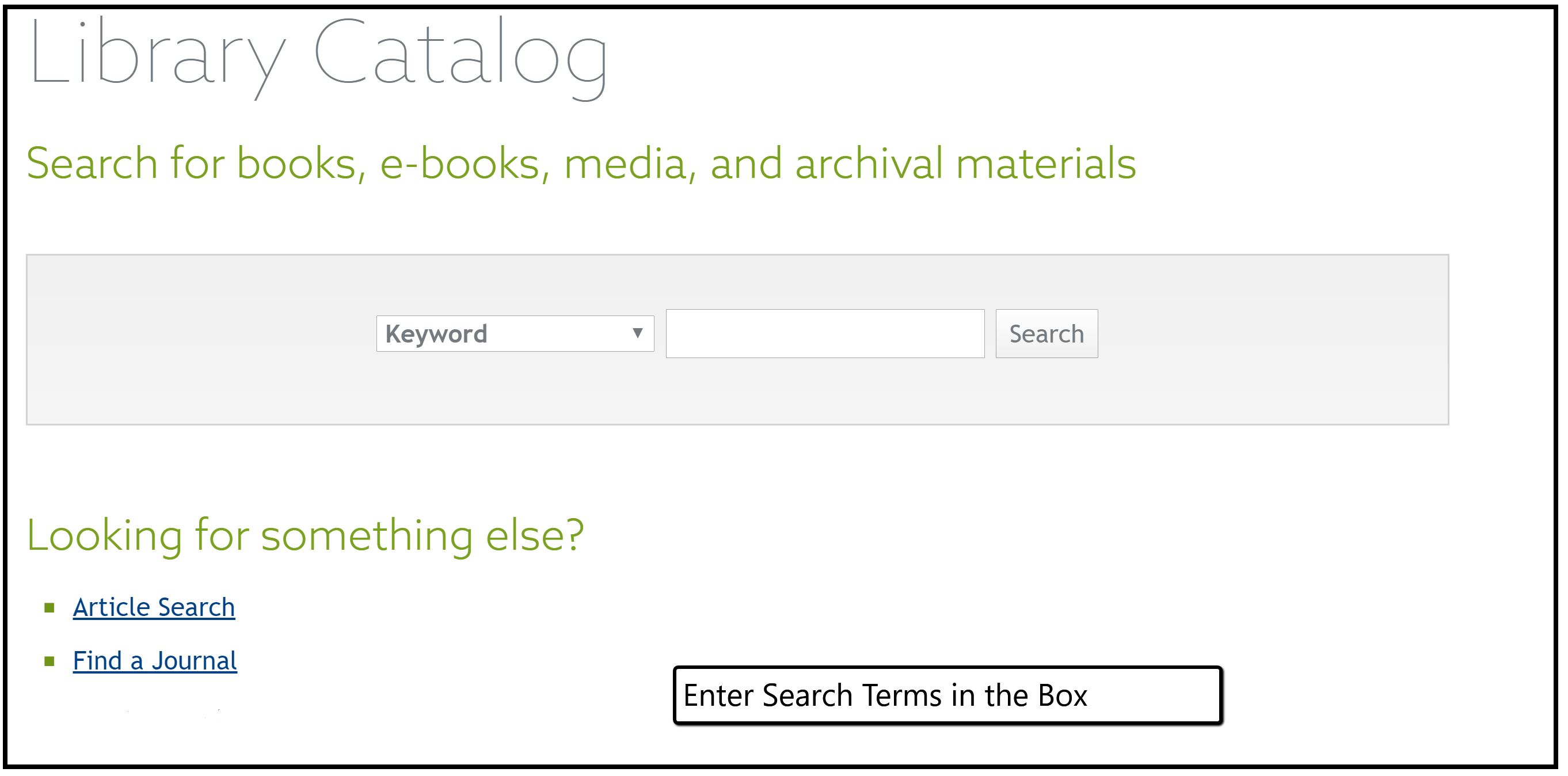
Figure 11.2: Example of Appropriate Contiguity in a Graphic
Written Materials
Librarians produce many types of written materials, including brochures, pamphlets, reading lists, flyers, fact sheets, and informational guides. Written materials can be shared in hard copy, such as handouts or worksheets to accompany a workshop, or they can be posted online to be read or printed out at the reader’s convenience. This section focuses primarily on written materials in hard copy but will also address considerations for online materials.
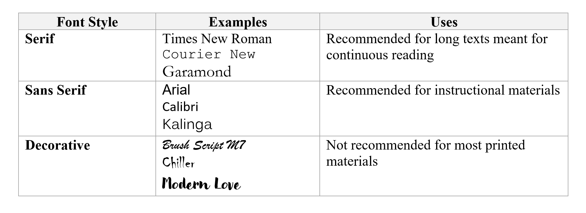
Since printed materials, unlike their online counterparts, cannot be manipulated by the reader or read aloud by a screen reader, we need to follow best practices to increase their accessibility and readability. Choosing an appropriate font is the first step, and the focus should be on a clean, clear font with adequate spacing between letters (Kitchel, 2011/2019). The main choices for font are between serif and sans serif. The characters in serif script have an extra line or decorative stroke on the edges. Popular examples include Times New Roman and Courier. Sans-serif characters are made up of straight lines. Examples of sans-serif fonts include Arial and Calibri.
Although there is little research to suggest that font style substantially impacts reading speed or comprehension for most readers, people tend to express a preference for serif fonts, which are often recommended for long blocks of text such as textbooks (dos Santos Lonsdale, 2014). However, sans-serif fonts are recommended for people with visual and other disabilities (Kitchel, 2011/2019), and research suggests these fonts might increase comprehension as well as readability for people with certain disabilities (Wilson & Read, 2016). As such, sans-serif fonts are best for the written materials we are likely to use in our instruction.
We should avoid the use of fonts with unusual features or ones that might distort when printed or copied. These include fonts with fine lines or a mix of thick and thin lines; those with small internal spaces, such as the openings in a lowercase “b” or “d,” as these might fill in when printed or photocopied; and condensed fonts, or those in which individual letters touch each other (dos Santos Lonsdale, 2014). In general, we should avoid any decorative font that is meant just to “dazzle” and which “calls attention to itself rather than to the text” (dos Santos Lonsdale, 2014, p. 33). Figure 11.3 summarizes the considerations for font choice and provides some examples of different types of font.
Figure 11.3: Font Examples and Use
In addition to choosing an appropriate font, the American Printing House for the Blind (Kitchel, 2011/2019) recommends several other best practices for accessible print materials for all readers:
Font Size
The general recommendation is for 12-point font; 18-point font is considered large type and might be suitable for older adults and people with certain visual disabilities. Different fonts present differently, so we should experiment to find the appropriate size for our chosen font.
Adequate White Space
Substantial amounts of white space around text and graphics make printed materials easier to read. To avoid dense, crowded handouts, use at least one-inch margins and blocked paragraphs with space between each block, rather than continuous paragraphs with indents.
Minimal Text
Avoid dense blocks of text whenever possible. Keep language simple and straightforward and eliminate unnecessary information. Use lists and bullet points to break up text and increase white space. When appropriate, use graphics in place of text. For instance, rather than describing a display screen, include a screen shot.
Headings and Subheadings
Headings and subheadings help break up the text and increase white space. They also act as a navigational guide for the reader, providing an outline of the topic and its main points.
Highlighting Text
If we need to highlight or emphasize text within a block, we should use bold or underline, as italics are harder to read. Colored text is also problematic. Lighter colors do not provide enough contrast against the background, making the text harder to read. Also, some readers cannot distinguish color, so we should never use color to convey meaning. While bold and underlining are recommended, they should be used sparingly as they can distract the reader and interrupt the flow of the text.
Charts, Graphs, and Visual Elements
The best practices highlighted here apply to charts, graphs, figures, and other supplements, including the legends or captions that accompany them. These elements should be presented in the same size font as the main text, with adequate white space. The figure or chart itself should be of adequate size to be easily read and interpreted. It is better to move a chart or figure to a new page than to reduce the size to fit it on an existing page. Visual elements are addressed in more detail later in this chapter in the section on visual aids.
White Paper, Black Text
Materials should be printed on white paper with black text, as the high contrast makes for easier reading. If you must use colored paper, select a light color, such as pale yellow.
Accessibility of Written Materials Posted Online
We might post some of our instructional materials online to make them available after the session ends and to learners unable to attend sessions. In some ways, written materials are more accessible online than in print because learners can manipulate the document to increase text size and brightness or use screen readers. Best practices for printed materials generally apply equally well to written materials posted online. However, there are a few additional considerations for making online materials accessible.
Headings and subheadings are very important to online documents. Without these headings, a screen reader will read the page as one continuous narrative. However, with online materials, we cannot rely on using bold lettering and different size fonts to signal headings and subheadings, as we might with printed materials. Instead, we must use the headings function built into most word-processing programs. This technique will allow screen readers to recognize headers and subheaders, thus aiding in document navigation. In addition, these functions usually add some additional white space around the header, improving the overall appearance and readability of the document even when printed (Accessible U, 2019a). Similarly, we should use the word processor’s built-in functions for bullets and numbered lists.
If the document includes hyperlinks, the links should be embedded into the document, rather than giving the URL in the text (Accessible U, 2019b). Screen readers will read every character in the link, frustrating the listener and breaking up the flow of the text. Even in print, including the URL breaks up the text and interrupts the flow. Most word processors will have an option to embed a hyperlink into the text so when the document goes online, users can click the text to follow the link. Since users cannot follow the link in printed materials, you can include a list of URLs in a reference section at the end of the document. We should also avoid using phrases like “click here” as a link, but instead include some descriptive text with the link, so readers know what they will find if they decide to follow it. Following are examples of appropriate treatment of links in written materials.
Poor Practice:
- Why We Fall for Fake News (https://www.cits.ucsb.edu/fake-news/why-we-fall) explains cognitive bias.
- Fake news often preys on people’s cognitive biases. Click here to learn more.
Better Practice:
- Fake news often preys on people’s cognitive biases. The article Why We Fall for Fake News, from the Center for Information Technology at UC Santa Barbara, explains different types of cognitive biases and how they influence our thinking.
Visual Aids
Visual aids are instructional materials that include elements such as images and graphics. More than just a supplement to written learning materials, when used well, visual aids can lead to better learning. As Clark and Mayer (2016, p. 77) explain, “people learn more deeply from words and pictures than from words alone.” Meaningful graphics often can replace some text, further reducing cognitive overload. However, not all visual elements are equal, and when they are not used properly, they can detract from learning. We might think that adding some pictures or clip art to a handout or a slide will make the materials more engaging for the learner. But if the visuals are only included to make the materials “pretty,” the learner will waste cognitive energy processing the visual material without gaining new information or meaning. So, how do we use visual elements to increase learning?
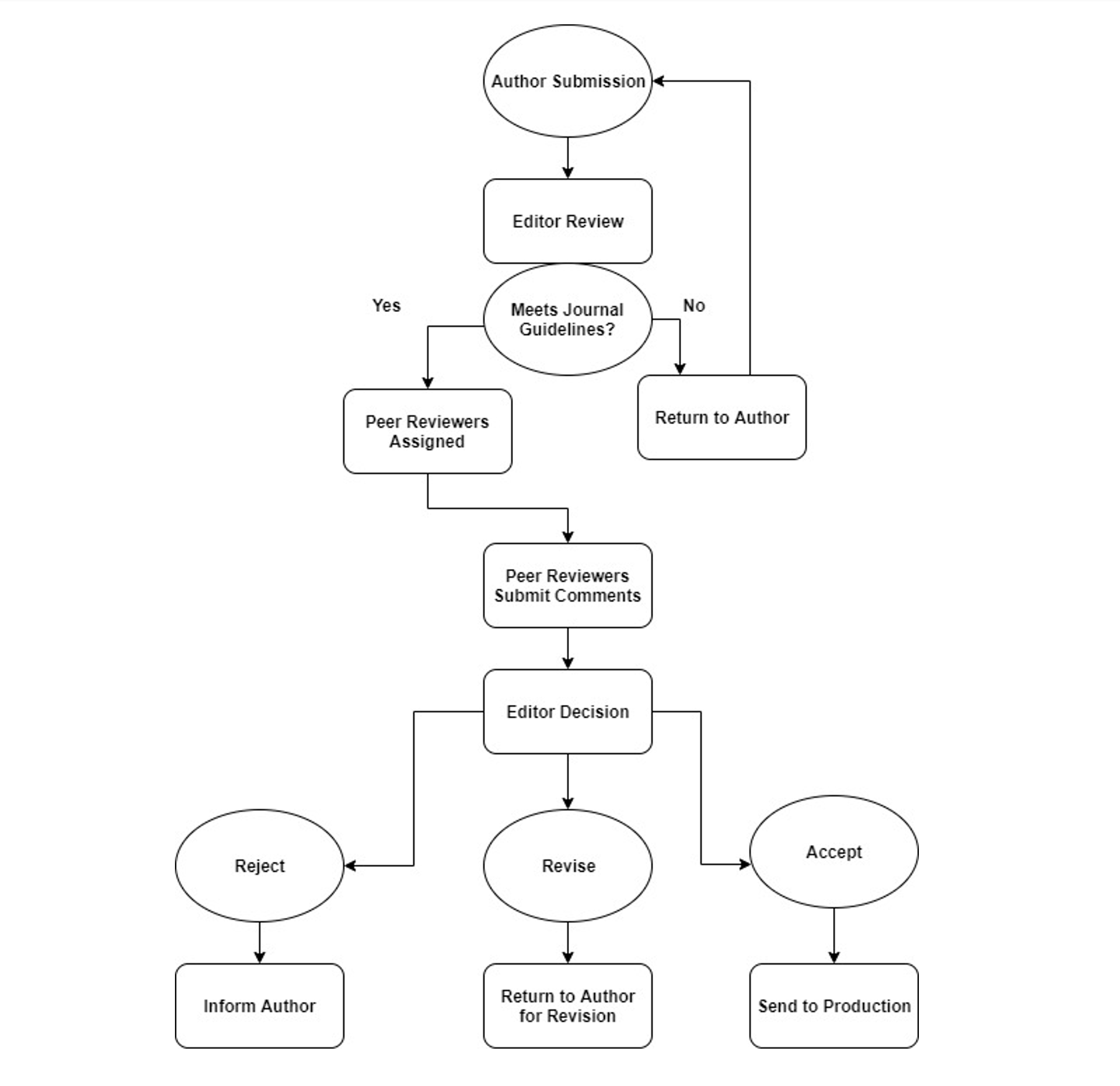
Meaningful visual elements show relationships among concepts, depict processes, organize information, and interpret information (Clark & Mayer, 2016). For instance, a visual aid could label elements of a figure, such as search fields in a catalog or the parts of a citation. Graphs and charts can condense complex quantitative and relational information into clear visuals. Flowcharts can illustrate processes, and organizational charts can show relationships among different entities. In each case, the visuals are conveying information, often using minimal text. Figure 11.4 and Figure 11.5 show two examples of instructional materials. Both describe the peer review process, but they are not equally effective.
Figure 11.4: Example of a Poorly Designed Visual Aid
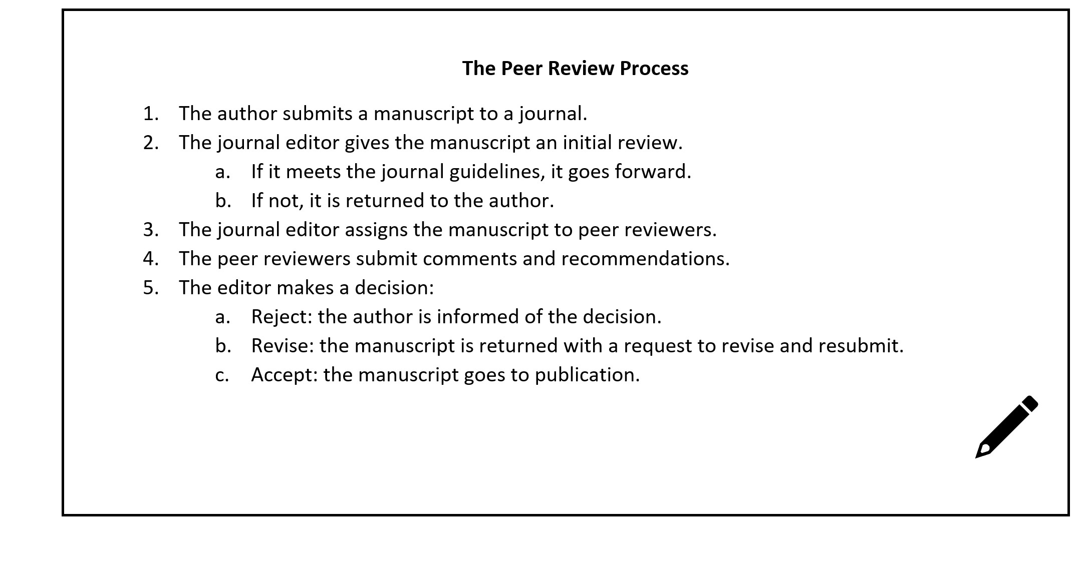
Figure 11.5 Example of a Properly Designed Visual Aid
High contrast between the background and the graphic are important (Association of Registered Graphic Designers of Ontario, 2010). Black-and-white graphics with bold lines are best, but if you use color, choose highly contrasting colors, such as dark lines against a light background. In general, avoid grayscale and light colors. Again, colors should not be used to convey meaning because that meaning would be lost to people who are using screen readers or who are unable to differentiate colors. In keeping with the contiguity principle mentioned earlier in this chapter, when visual aids combine text and graphics, the text should be placed next to the relevant part of the graphic to reduce the effort needed to connect the concepts.
Commonly available word-processing tools such as Microsoft’s Word or Google Docs usually are sufficient for creating basic handouts, and Word’s Illustrations function offers some options for creating simple graphics to depict workflows, hierarchies, and other relationships. However, both Word and Google Docs have limited capabilities for creating and integrating more complex visuals and offer minimal control over the formatting and placement of elements within a figure. Several free and low-cost options exist for more complex and visually appealing figures. For example, the flowchart depicted in Figure 11.5 was created in Draw.io, an open-source software for creating diagrams. Canva is a popular publishing and graphic-design tool that offers a free option and can be used to create slick handouts, brochures, and flyers. Other tools include Inkscape, TechSmith Capture (formerly Jing), Stencil, and PicMonkey. See Activity 11.1 for a brief exercise related to creating written materials.
Activity 11.1: Creating Written Instructional Materials
Imagine you are developing an information packet to be shared with new patrons at your library. Choose one of the examples below and develop a brief guide to be included in the packet. Consider using one of the free design tools mentioned in this chapter (Canva, Draw.io, Inkscape, etc.).
- Submitting an interlibrary loan request
- Creating an email account in a free service like Gmail
- Downloading a book on Overdrive
- Searching the library catalog or a library database
If possible, exchange materials with a partner and critique each other’s work.
Questions for Reflection and Discussion:
- Do you see examples of the best practices from this chapter?
- Are visuals used to their best effect?
- Do the font type and size seem appropriate?
- Could you offer any suggestions for improvement?
Charts, Graphs, and Tables
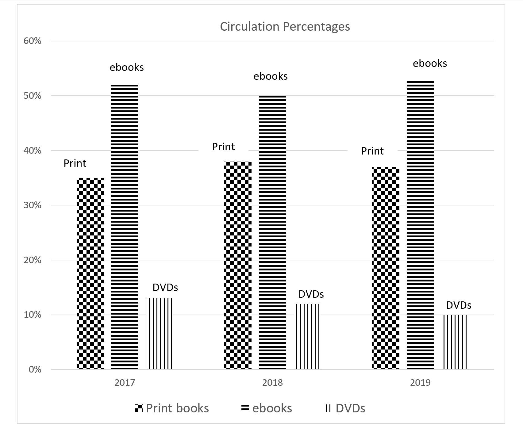
Charts, graphs, and tables are excellent ways of organizing and presenting data. Charts and graphs, in particular, can make complex information more comprehensible than it would be in raw-data form, and can make relationships among variables more readily apparent. However, these visuals also require some special considerations. Charts and graphs often use color to convey meaning. We tend to use color-coded lines or bars on graphs to correspond to different variables, or shade regions of a map to represent information, such as population density. To make these materials accessible, we can use patterns—such as dots of varying size and stripes of varying density and direction—rather than colors to differentiate variables. Another option is to use one color and vary the shade, rather than using different colors. Often, different colors have similar levels of brightness and will appear almost identical when rendered in grayscale or viewed by color-blind readers. Using a single color but highly varied levels of brightness will make the figures readable even if the reader cannot distinguish the color. However we decide to render the figures, labeling relevant parts of the graphic reduces the need to rely on colors and a legend to understand the figure (IT Accessibility Group, 2019a). See Figure 11.6, Figure 11.7, and Figure 11.8 for examples of inaccessible and accessible figures, based on circulation rates of materials at a public library.
Figure 11.6: Chart Using Color to Convey Meaning
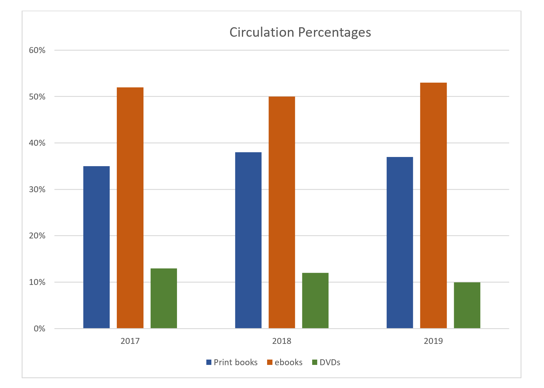
Figure 11.7: Chart Using Different Shades of the Same Color to Convey Meaning
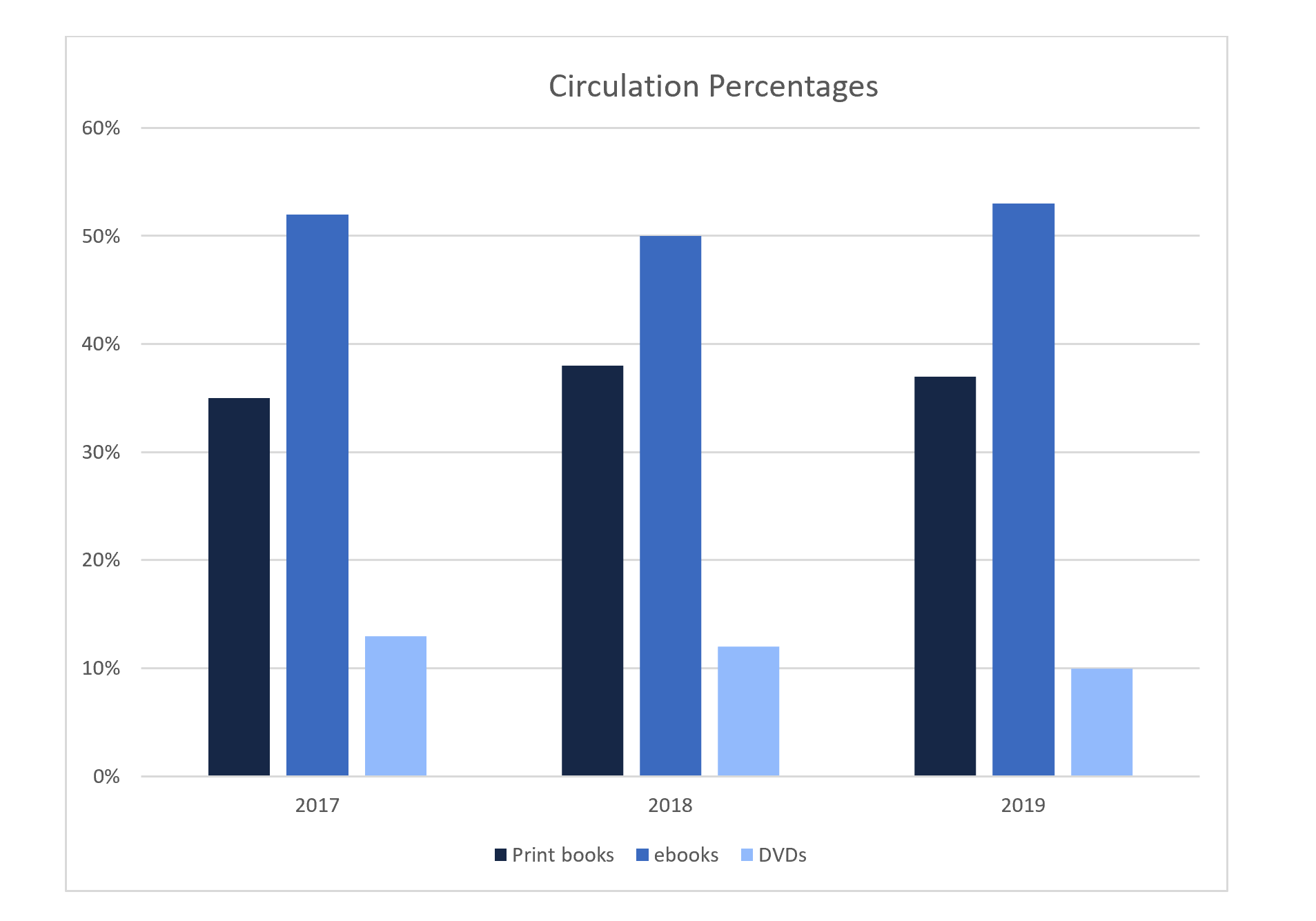
Figure 11.8: Chart Using Patterns to Convey Meaning
Tables can also present some difficulty for users with disabilities and those using screen readers. Gridlines, meant to help organize table elements, can be distracting to the eye. Using a softer gray color for the gridlines and black for the table elements can help the data stand out while still providing a visual guide for the eye. Similarly, we can alternate table rows with gray background fill and no fill, but in this case, we need to choose a very soft shade of gray to ensure enough contrast for the text to be readable (Agency for Healthcare Research and Quality, 2019). We should also designate header columns and rows, so screen readers can distinguish between column and row labels and the data in the rest of the row or column (WebAIM, 2017).
Images and Photographs
Like other visual aids, images or photographs should be clear, bright, and of adequate size. If possible, crop large images to include only the relevant parts. Cropping reduces extraneous information, and you may be able to enlarge the cropped image for easier viewing. But be aware that resizing images can impact their quality and accessibility. If the image becomes too small, details might be lost; however, some images will pixelate and lose clarity when enlarged.
While written material is often more accessible online, where readers can enlarge fonts or use screen readers, visual materials can present challenges: images might not load; screen readers cannot always interpret the content of visuals, especially images; and some viewers who can see well otherwise might not tolerate certain visuals, such as animations (Accessibility at Yale, 2019). To ensure accessibility, images and photographs posted online should be accompanied by brief, explanatory notes known as alt text. Alt text should describe the image and the content it is meant to convey within the context of the instruction, with a focus on salient points. Alt text is meant to be brief, and, ideally, should be no more than 125 words. In keeping with the coherence principle, we should avoid images and graphics that are purely decorative, but if such images are used, then the alt text tag can be entered as “null.” If a visual is complex and requires a lengthy description, experts suggest embedding that description in the text and using the alt text tag to direct the reader to that description (IT Accessibility Group, 2019b). Chapter 16 covers alt text in more depth.
Slide Decks
Slide presentations, such as those created in PowerPoint and Google Slides, remain popular in both face to face and online instruction. In addition to slides helping instructors stay organized and on topic, some research suggests that access to lecture slides before a lesson can improve learning (Marsh & Sink, 2010; Motagi & Dharwadkar, 2018). Learners also express a preference for handouts accompanying lectures (Stacy & Cain, 2015). By providing some of the main content, these handouts might reduce the need to take as many notes, thus freeing students to listen more closely to the lecture. In fact, Marsh and Sink (2010) found that learners who had access to lecture slides took fewer, but higher quality, notes. Several best practices apply to slide decks:
- Use highly contrasting colors for the background, text, or graphics, and keep the background design plain.
- Use the predefined slide layouts, as these are usually designed to work with screen readers (Accessible U, 2019c).
- Use clean, easy-to-read fonts, and make sure the font size is large enough to be seen by people in the back of the room.
- Use clear graphics and images, and make sure graphics are large enough to be seen by people in the back of the room. As noted above, be sure to include alt text for images and graphics.
- When possible, crop images to show only relevant areas. As necessary, use arrows or boxes to draw attention to relevant parts of the graphic.
- Keep animations and slide transitions to a minimum (TED Staff, 2014).
- In keeping with the coherence principle mentioned earlier, do not include any unnecessary words or images on the slides (Clark & Mayer, 2016).
- In keeping with the redundancy principle, use graphics instead of on-screen text in slide decks (Clark & Mayer, 2016). This practice reduces cognitive load by eliminating the need for students to reconcile the written text with what they are hearing in a lecture or demonstration. Also, if both text and graphics are used, we can overload the visual channel. However, text can be included in certain situations:
- A few key words to reinforce concepts and ideas
- When terms are technical, unfamiliar, lengthy, and/or needed for future reference, such as a mathematical formula, or steps in a procedure
- If you include labels for graphics, place the words next to the relevant part of the graphic.
See Activity 11. 2 for a brief activity on slide decks.
Activity 11.2: Creating Effective Slide Decks
The presentation Quite Possibly the World’s Worst PowerPoint Presentation Ever consists of a series of paired slides. The first slide in a pair illustrates at least one example of bad design, while the second slide identifies the design issue and how to fix it. As you look at each pair of slides:
- See if you can identify what is wrong with each “problem” slide before advancing to the answer.
- Suggest ways you could fix each slide to reflect better design principles.
- Do you notice any issues not addressed in the answer slide?
Videos
Videos are a popular instructional tool and are discussed at length in Chapter 16. As such, this section will provide only a brief overview.
Videos should be clear, accessible, and engaging, but they do not need to be fancy and full of complicated or high-tech add-ons. In fact, as with most instructional materials, less is usually more. We do not necessarily need expensive equipment to create effective instructional videos. Just a computer, webcam, and headset with a microphone will suffice. If necessary, we can use a computer’s built-in audio system to record, but a separate microphone usually provides clearer audio, while a headset helps to reduce background noise.
Following the coherence principle, eliminate any extraneous spoken or written words or images. Focus on audio narration with images for support, rather than on-screen text. When text and graphics are used together, the text should align with the relevant portions of the graphic (Clark & Mayer, 2016).
Closed captioning is crucial to make videos accessible to learners with hearing disabilities and, as with all universal design techniques, can improve accessibility for all learners. Some students might not have access to devices with audio equipment or might need to view the videos in noisy areas, like on a train. These learners will also appreciate closed captioning. The captions should appear on screen and in sync with the video. Some video software packages offer auto-captioning, but the accuracy of the automatically generated text rarely meets requirements for accessibility, so we should be prepared to edit.
Finding Existing Instructional Materials
Most of this chapter assumes that we will be creating our own instructional materials, and homegrown materials have the advantage of being completely customizable. However, creating materials from scratch is not always necessary and, at times, may not be feasible. Complex images and sophisticated multimedia tutorials can be engaging, but they also require time, knowledge, and equipment to create. Rather than developing these materials on our own, we might search online repositories for existing materials. The ACRL Framework for Information Literacy Sandbox provides access to a wide variety of materials on information-literacy topics, including slide decks, worksheets, and multimedia tutorials. Many libraries post freely accessible tutorials on their websites. YouTube provides access to videos on an immense range of topics, including TED Talks on a number of relevant education topics. We can also search repositories like Flickr, Google Images, and Pixabay for photographs and images. Some information settings will also have access to subscription sources of videos and tutorials. For instance, LinkedIn Learning offers tutorials on a wide range of technology and business topics.
Copyright
Whenever we use instructional materials created by someone else, we must be sure we are following all relevant copyright guidelines. Copyright protection means that, in general, we cannot use other people’s work without their permission. Currently in the United States, creative works are subject to 96 years of copyright protection; thus, as of 2020, works created after 1925 are covered by copyright. After 96 years, works enter the public domain, and they are free to use without restriction. While reuse of copyrighted materials for noncommercial, educational purposes is often protected by fair use, such protection is not guaranteed, and there are limits to fair use. Four factors are usually used to determine whether fair use exceptions apply to a specific circumstance (Copyright.gov, 2019):
- Purpose and character of the use. Generally, nonprofit, educational use of copyrighted materials is covered by fair use while commercial use or use of the material that will result in a profit for the user, is not. The government warns that not all educational or nonprofit use will be covered by fair use, nor will all commercial use necessarily be exempt from fair use, but instead, “courts will balance the purpose and character of the use against the other factors” (Copyright.gov, 2019). Transformative use, or use that adds something new to the work for a different purpose, is more likely to be considered fair use than use that is not transformative.
- Nature of the copyrighted work. Technical and factual materials are more likely to fall under fair use than creative materials such as poems, songs, and artwork.
- Amount and substantiality of the portion used in relation to the copyrighted work as a whole. In determining fair use, courts consider the quantity and quality of the material used. Larger excerpts or excerpts that represent the “heart” of the work are less likely to be covered by fair use.
- Effect of the use upon the potential market for or value of the copyrighted work. Part of the purpose of copyright is to protect the creator’s right to profit from their work. If reuse of the material will hurt the market for the original work, it is less likely to fall under fair use.
If we decide to reuse existing materials, we must apply all four factors to determine if we are protected by fair use. When in doubt, it is always best to request permission.
We should also be sure to check the licensing agreement for any material we use. Some creators choose to share their copyrighted materials by using less restrictive forms of licensing, which allow for more opportunity and flexibility for reuse by others. Creative Commons enables creators to choose from several different licenses. The least restrictive requires only that the user attribute the material to the creator. Other licenses allow reuse for noncommercial purposes, limit derivative works, require users to share any derivative work they create through a similar open license agreement, or some combination of these options. If the work we wish to use has a Creative Commons license, we can generally reuse it without permission, provided we follow the licensing restrictions and requirements. If we do not see a Creative Commons license, we should assume the material is protected by traditional copyright restrictions.
Conclusion
Instructional materials, both written and visual, are an integral part of teaching and, when used appropriately, can engage learners and deepen learning. Creating effective instructional materials takes time and perhaps some practice, but it does not require expensive equipment nor expertise in graphic design or multimedia tools. The major best practices and takeaways from this chapter are as follows:
- Our brains process visual and auditory materials through two different channels. Integrating visual materials so that they support, rather than compete with, our lectures and demonstrations reduces cognitive load and can increase learning.
- In general, the best materials are simple, clean, and straightforward. We should reduce any extraneous words and images from our instructional materials.
- We should always ensure our instructional materials are accessible to all learners, including providing alt text for images and closed captions for videos.
- When reusing existing materials, we must be sure to adhere to appropriate copyright restrictions.
See Activity 11.3 for a brief exercise on instructional materials.
Activity 11.3: Critiquing Instructional Materials
Search online to find examples of instructional materials from the type of information setting in which you would like to work and take a moment to review them.
Questions for Reflection and Discussion:
- Can you find examples of the principles and best practices discussed in this chapter?
- Can you find any room for improvement related to those principles and best practices?
Tools
Canva. https://www.canva.com/
Draw.io. https://www.draw.io/
Flickr. https://www.flickr.com/
Google Docs. https://drive.google.com/
Google Images. https://www.google.com/imghp?hl=en
Google Slides. https://www.google.com/slides/about/
Inkscape. https://inkscape.org/
LinkedIn Learning. https://www.linkedin.com/learning
PicMonkey. https://www.picmonkey.com/
Pixabay. https://pixabay.com/
PowerPoint. https://www.microsoft.com/en-us/microsoft-365/powerpoint
Stencil. https://getstencil.com/
TechSmith Capture. https://www.techsmith.com/jing-tool.html
Word. https://www.microsoft.com/en-us/microsoft-365/word
YouTube. https://www.youtube.com/
Suggested Readings
Accessible U. (2019). Start small, start now. University of Minnesota Office of Disability Resources. https://accessibility.umn.edu/start-small-start-now
The Office of Disability Resources at the University of Minnesota offers a number of guides on creating accessible materials. Each guide is brief, clear, and easy to understand. Whenever possible, the office includes step-by-step instructions for specific software packages, such as YouTube or Google Slides. Some guides are supplemented by videos and multimedia tutorials.
Association of Graphic Designers of Ontario. (2010). Access ability: A practical handbook on accessible graphic design. https://www.rgd.ca/database/files/library/RGD_AccessAbility_Handbook2010_.pdf
This concise handbook offers practical advice for creating accessible print and web materials. A third section focuses on accessibility of physical spaces. Each section is supplemented by an interesting case study.
Clark, R. C., & Mayer, R. E. (2016). e-Learning and the science of instruction (4th ed.). John Wiley & Sons.
Experts in the area of elearning, the authors provide an overview of how people learn through audio and visual channels, lay out the nine principles of best practice for instructional design, and devote a chapter to applying each principle. Additional chapters explore collaborative learning and gaming. Each chapter is grounded in research but also offers plenty of practical advice and examples.
Inman, J., & Myers, S. (2018). Now streaming: Strategies that improve video lectures. IDEA Paper #68. Idea Center, Inc.(ED588350). ERIC. https://eric.ed.gov/?id=ED588350
This brief report offers clear and straightforward advice for creating effective and accessible videos.
Stony Brook University Libraries. (2019, September 18). Copyright, Fair Use, & the Creative Commons: Home [LibGuide]. https://guides.library.stonybrook.edu/copyright/home
This LibGuide gives a thorough yet concise overview of copyright concerns, including an introduction to fair use guidelines and Creative Commons licenses. The guide includes tools for helping to determine fair use, a list of tutorials on copyright, and additional information on related topics such as the TEACH Act, open access, and orphan works.
References
Accessibility at Yale. (2019). Images. Usability & Web Accessibility. https://usability.yale.edu/web-accessibility/articles/images
Accessible U. (2019a). Headings. University of Minnesota Office of Disability Resources. https://accessibility.umn.edu/core-skills/headings
Accessible U. (2019b). Hyperlinks. University of Minnesota Office of Disability Resources. https://accessibility.umn.edu/core-skills/hyperlinks
Accessible U. (2019c). Google slides. http://accessibility.dl.umn.edu/presentations/google-slides
Agency for Healthcare Research and Quality. (2019). Six tips for making a quality report appealing and easy to skim. https://www.ahrq.gov/talkingquality/resources/design/general-tips/index.html
Association of Registered Graphic Designers of Ontario. (2010). Access ability: A practical handbook on accessible graphic design. https://www.rgd.ca/database/files/library/RGD_AccessAbility_Handbook2010_.pdf
Clark, R. C., & Mayer, R. E. (2016). e-Learning and the science of instruction: Proven guidelines for consumers and designers of multimedia learning (4th ed.). John Wiley & Sons.
Copyright.gov. (2019). More information on fair use. https://www.copyright.gov/fair-use/more-info.html
dos Santos Lonsdale, M. (2014). Typographic features of text: Outcomes from research and practice. Visible Language, 48(3), 29-67.
Heick, T. (2019, November 7). What is cognitive load theory? A definition for teachers. Teach Thought. https://www.teachthought.com/learning/cognitive-load-theory-definition-teachers/
Kitchel, J. E. (2019, September 11). APH guidelines for print document design. American Printing House for the Blind. (Original work published August 2011) https://www.aph.org/aph-guidelines-for-print-document-design/
Marsh, E. J., & Sink, H. E. (2010). Access to handouts of presentation slides during lecture: Consequences for learning. Applied Cognitive Psychology, 24(5), 691-706. https://doi.org/10.1002/acp.1579
Motagi, M. V., & Dharwadkar, K. (2018). Evaluation of the effectiveness of providing PowerPoint slide handouts before the class. International Journal of Medical Science and Public Health, 7(9), 739-741. https://doi.org/10.5455/ijmsph.2018.0205413062018
IT Accessibility Group. (2019a). Charts & accessibility. Accessibility and Usability at Penn State. https://accessibility.psu.edu/images/charts/
IT Accessibility Group. (2019b). Image alt text. Accessibility and Usability at Penn State. https://accessibility.psu.edu/images/alttext/#caption
Stacy, E. M., & Cain, J. (2015). Note-taking and handouts in the digital age. American Journal of Pharmaceutical Education, 79(7), 107. https://doi.org/10.5688/ajpe797107
TED Staff. (2014, July 15). 10 tips on how to make slides that communicate your ideas, from TED’s in-house expert. TED Blog. https://blog.ted.com/10-tips-for-better-slide-decks/
WebAIM. (2017, September 18). Creating accessible tables. https://webaim.org/techniques/tables/data
Wilson, L., & Read, J. (2016). Do particular design features assist people with aphasia to comprehend text? An exploratory study. International Journal of Language & Communication Disorders, 51(3), 346-354. http://doi.org/10.1111/1460-6984.12206
